
A walkthrough of my mobile app redesign for Raiffeisen Bank with new features implemented.
Project type:
App redesign and adding features
Role:
Sole UX designer and researcher
Tools:
Figma
A walkthrough of my mobile app redesign for Raiffeisen Bank with new features implemented.
App redesign and adding features
Sole UX designer and researcher
Figma
My father is a Raiffeisen Bank user. Not too long ago, I was looking through his phone, specifically analyzing Raiffeisen Bank’s app, since I was looking to open a bank account and I didn’t know what bank would best suit my needs. I found myself a little confused at times while briefly using the app so I went to my dad and asked “How do you transfer money from your main account to the savings account?”. He took the phone, fondled a little bit with it and with a confused face finally said “It was a bit complicated, I can’t remember off the top of my head how I did it last time.”
I also noticed the lack of some features that you can find in other banking apps, such as monthly spending analytics, recurring payments management and alerts, categorizing retailers and spending, adding money using other cards.
Naturally, I decided to make some reasearch and familiarize myself with Raiffeisen’s User Interface using competitor analysis and user review research.
I first decided to take a look at other competitors, such as Revolut, BT Pay, some of the most used banking apps in Romania to date, examining how they create a more user-friendly and intuitive experience and the implemented features.

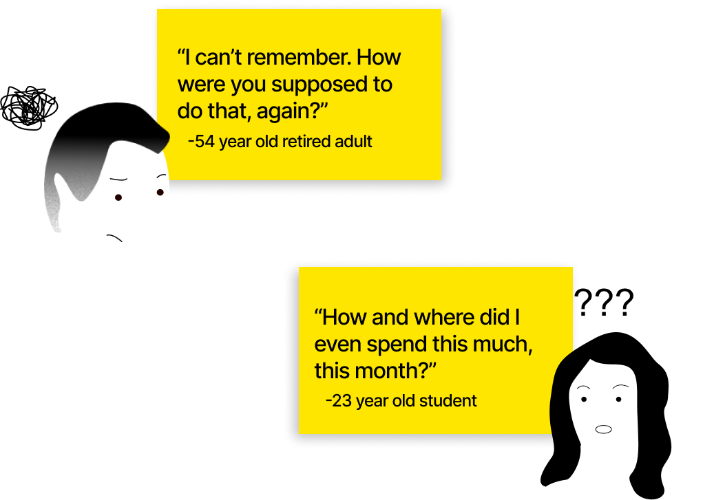
It was important to also note the experience of real users and analyze their feedback on the app. Below you will find some of the most critical feedback from appstore, google play, reddit.

To define the problem, users want a variety of features to help them with budgeting, keeping track of their spending, a more intuitive app with a more modern, comfortable user interface.

I wanted to create a user persona to embody the Raiffeisen user based on the full research process I conducted, incorporating insights from the user reviews, competitor analysis, and major pain points. By synthesizing the gathered data, my aim is to represent the user's preferences, pain points, and behaviors, allowing for a more focused and effective redesign for our ideal user.

The first step I took into the redesign process was to analyze the existing taskflows for different features that the app already provides and see if there could be any ways to improve them in order to obtain a more clean and intuitive experience.
Transferring money from your current account to your savings account

The taskflow for transferring money from your current account to your savings account is the same as the taskflow for a usual payment through IBAN, which I find very unfamiliar, esspecially when comparing it to other banking apps.So, the approach that I took consists of a much more simplified and intuitive taskflow.

See and manage recurring payments

The taskflow for recurring payments is not too long or overly complicated. It is actually pretty straight-forward. The problem that I found is that for someone like Adrian, our user persona, is important that these recurring payments are more “in his face”, so there would be no way for him to forget about a free trial that he signed up to and it’s ending, or a subscription he forgot about that he’s not even using. That being said, I went ahead and placed the recurring payments right on the dashboard. Also adding a notification for when a payment is due the next day would be helpful.

Based on the user reviews and the competitor analysis, I came up with a few features that Raiffeisen could implement.
Budgeting income
A feature that helps you allocate your monthly income by setting up customized spending categories, tracking expenses, and offering insights to stay on top of your financial goals.
Building a savings plan
A feature that lets you set up automatic monthly transfers from your income to your savings account on a specific date, helping you build your savings effortlessly and consistently.
Adding money to account options
A feature that lets you easily deposit money into your account by using a credit or a debit card, apple pay, direct transfers, providing flexible and convenient ways to top up your balance.
Spending analysis
A feature that provides a detailed monthly analysis of your spending habits, helping you track expenses, identify trends, and manage your finances more effectively.
Before diving into designs, I first took a look at Raiffeisen bank’s brand guidelines to see what key details should be maintained throughout the app designwise since it’s important to maintain the brand’s indicators and appearence while also keeping the design simple and accesible to users.

Low fidelity
Here are some of my initial thought processes regarding the look and the goals for the app. These low fidelity designs proveded me with a first glimpse of how this app could potentially look and work.

Mid Fidelity


